
Notification system
Wealthsimple – Jul 2022
My role
Lead designer: Interaction Design, Visual Design, User Flows, Rapid Prototyping
Team
Lily, PM
Chantelle, UXW
Rameen, ENG
Timeline & Status
2 months, revised MVP launched in late 2023
Overview
In early 2022, WS merged their apps into 1 unified app. Notifications were crucial for users to get timely stock and account information. However, the newly unified app only had limited push notifications with fragmented ways to manage them.
I owned and lead design for the notification system in support of the unification – playing a critical role in scoping and prototyping what used to be in 3 different apps (Invest, Trade, Cash).
Highlights
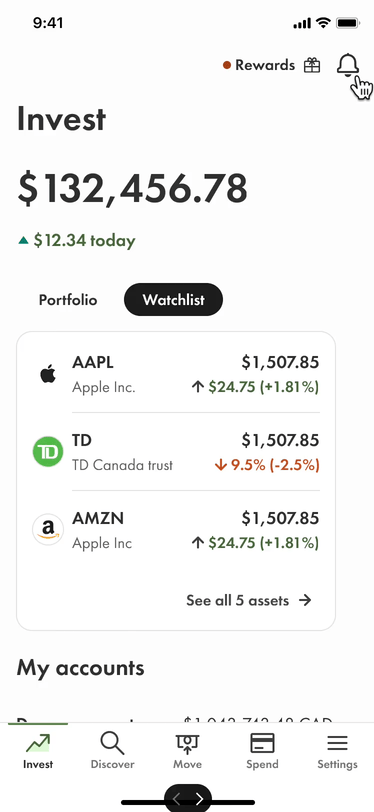
New notification center for all your finance needs – trade, invest, spend
Manage global notification
Manage stock notification
Context
A unified Wealthsimple app
In Q2 of 2022, Wealthsimple has launched a new app that unified the company's various financial offerings under one roof, combining separate apps for investing, trading, taxes, and cash into “one financial super app”.

Problem space
WS offers limited types of alerts and notifications
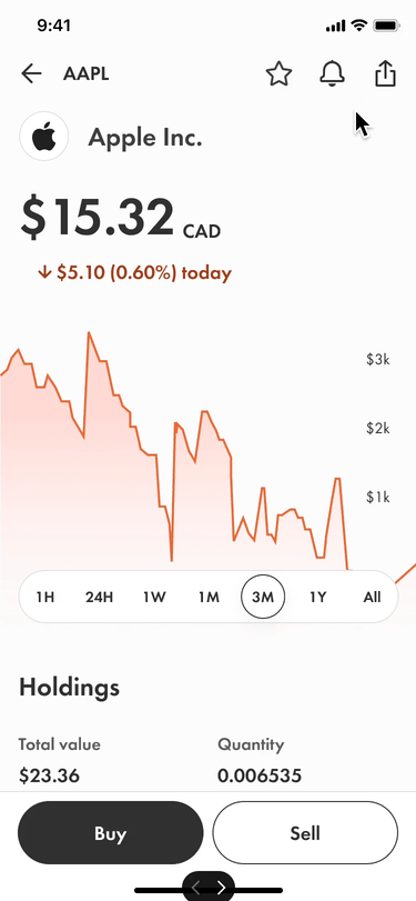
⭕️ In Q1 of 2022, the only alert users could set was price alert (for stocks).

⭕️ There was no central place to manage price alerts; users need to go to each stock’s page to manage them.


Alerts back then
Emerging opportunities
💡 What if users can freely set all types of alerts so that they are more educated and make informed decisions?
💡 WS can provide value at every stage in our clients’ transaction journeys, not just when they’re ready to make a trade.
❗️ Caveat: WS’s vision and direction were evolving rapidly. Design decisions could become outdated soon and pivoting was inevitable.
The low hanging fruit
Creating new alerts is the quickest way to add value. As I was ramping up and getting familiar with the design system, I quickly shipped more advanced price alerts such as daily schedule, daily 52-week high/lows, etc.
Using progressive disclosure, the explanatory text only shows up when users selects it.
Ship and improve
Delete, filter, and sort – so users can see the most important alerts to them
Managing alerts on each stock page is cumbersome. After shipping the MVP, I decided to follow our philosophy “ship and improve” to find solution to improve alert management.


❌ Problem 1
Alert deletion is hidden behind swiping gesture, not accessible. Alert management is local to each stock (hard to discover).
❌ Problem 2
No filtering or sorting of alerts. For power users with lots of alerts, alert modal screen is filled with active and triggered alerts.
Assumptions
Baby steps – assuming users filter one at a time
We had no capability for research on this project, so I started with an educated guess that most users filter one at a time.
By utilizing the empty space in the top nav component, I explored using bottom sheet to filter, and going into alert management settings for each stock.
Test boundaries – assuming mental modal and power user behaviour
After design review, I realized several points to consider in my last iteration.
Observation of current design: active (not-yet-triggered) price alerts are always on top. Triggered alerts always below – do alerts matter after they are triggered? Should we remove triggered alerts automatically?
Should we divide the page into triggered vs. active alerts?
What if users want to filter multiple?
Default sort is by alert type, do we allow other sorting and grouping?
Using toggle to activate & inactivate alerts is tricky, if I disable an alert – toggle off, should the entire alert be removed after user leaves the page?
These are all valid points to prototype and test once an MVP is shipped.
Boundary testing
Different styles that afford filtering: pills, dropdown, button
Different ways to filter: bottom sheet, paginated, accordion
Different filters: alert type, currency, asset class…
Sectioning the page into triggered alerts (incl. news) vs. active (assuming users care less because condition not met)
Recommended paged filter for north star due to its scalability and least amount of change to the current design system. Stakeholder liked the tabbed approach, but said editing and deleting is clunky. He wanted all features to be in one view.
Pivoting
While I was focusing on price alerts, the company was also undergoing a shift for the app to be less “Invest” and more unified. My team and I realized my previous design was only considering alerts for stocks.
In a unified app where users who also receive notifications when they move money or spend, how would my design scale?
Think big, think unified
Pivoting to a unified notification system
I started with exploration of where we’re at and what solutions are on the market place. This includes notification content, priority, display, destination, etc.
North star
New notification center for all your finance needs – trade, invest, spend

